13-15 Peel Street, Central, Hong Kong | year: 2018 | status: built | type: residential | area: - | team: Annette Chu & Gigi Chiu | photo credit: wangslok |
Award: Iron Award, Interior Space and Exhibition Design, A’ Design Award 2018
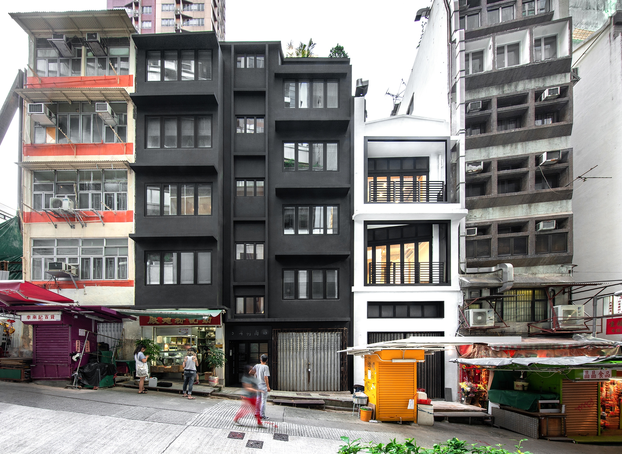
The project is a renovation to a 4 storeys tenement building from 1950s in Peel Street, Central, a Hong Kong neighbourhood which undergoes rapid redevelopment.
The design is the interplay between existing and new, rough and craft elements in this walk up building. The exterior of the building is painted completely black to contrast the vibrant street life, and highlighting the life inside the old Chinese noodle store which the owner wants to retain and the new Western coffee shop she introduces. This inspires us to keep the existing building envelope intact and retain some old features.
Our first memory of walking through the existing old building was a 50 years old Chinese noodle store on the left-hand side of the entrance. We heard the owner chit chatting with his regular, we entered the gate. Walking up the internal staircase, we found a handwritten Chinese flat number “No.15 fourth floor” on the wall in front of its door. It propelled us to keep the element of traditional handcraft typography in our design. We later approached one of very few stencil craftsmen left in Hong Kong to chisel some signages for us.
Mounting next to the entrance gate is a metal plate telling a brief history of Peel Street. On both sides are some letter boxes with letters on zinc stencil. The existing concrete stairs with ceramic tiles nosing are kept, and the damaged part is painted with a number using a similar stencil during repair, indicating the step number hinting one’s whereabouts.
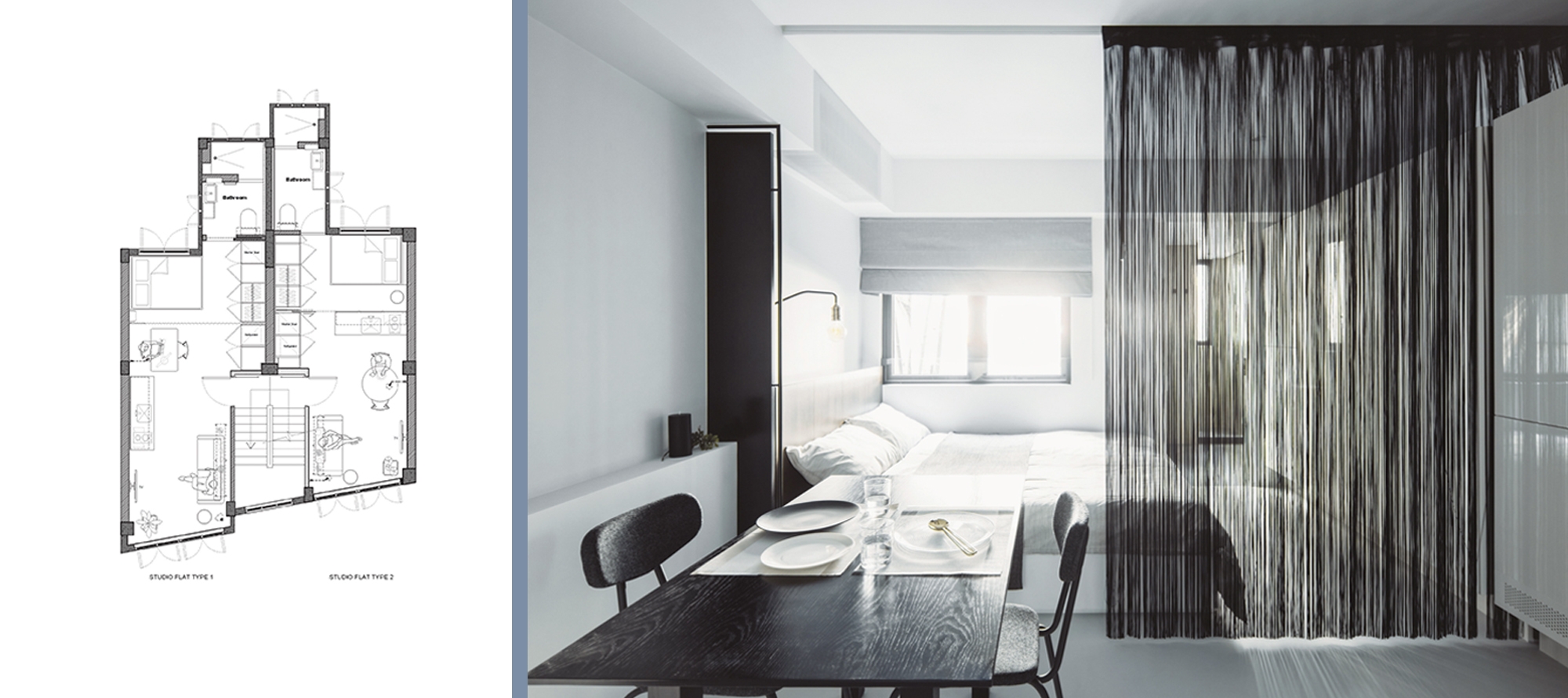
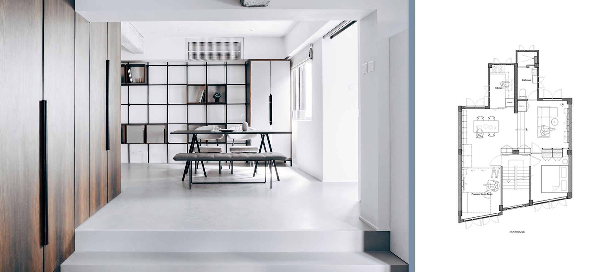
There are seven units in total in the building, with six studio flats and one 2-bedroom flat. Outside each unit is a thin black steel frame for umbrella with the flat number plate and an entrance light. Internally, renders of the old concrete columns and beams are hacked off carefully and remain exposed, and the design introduces a clean lines design with a limited palette of materials. The two different layout calls for two different settings for the studios. One uses a bespoke sliding timber screen adding a warm element to the concrete and the light grey epoxy flooring, while the other uses a string curtain resulting a more theatrical atmosphere. Thin steel black frames are used throughout the interior to create sense of lightness. Natural timber veneered panels are used as highlights, for furniture including splash-back of the pantry. To achieve that, special timber panels with a PVDF overlay are used to ensure they are anti-moisture and anti-bacteria. Bathrooms are kept in a grey monotone using a combination of ceramic tiles and cement renders. One side is cladded with stainless steel panels sand-blasted with a varying degree by hand to create a dreamy effect.
For the 2-bedrooms flat, the design caters a partly undetermined layout. A modular furniture system with pull-down bed and moveable boxes is installed along two main walls. Together with the bi-folding metal screens, tenants can decide on their living room and bedroom location and organize their preferred interior arrangement.
The roof of the building is intended a communal space where tenants can mingle. Each roof is equipped with a dark grey stained concrete sink with exposed aggregates, and next to the two concrete sinks are large troughs for plants or beer baths.


